Enrolment options
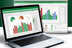
Microsoft Excel တွင် ဒေတာများကို သဘောတရားကျကျ မြင်သာလွယ်သလို ပြသနိုင်စေရန် Professional Charts & Graphs မျိုးစုံကို လေ့လာကြည့်ရှုသွားရမှာပဲဖြစ်ပါတယ်။ သင်တန်းတွင် Visualization Techniques၊ Chart Customization Skill များကို အဆင့်မြင့်ပုံစံဖြင့် လေ့လာနိုင်မည် ဖြစ်ပါသည်။ မည်သည့်လုပ်ငန်းအတွက်မဆို Data ကို အကျိုးသက်ရောက်မှုရှိရှိ ပြသနိုင်ရန် Excel Visualization Tool များကို လက်တွေ့ ပြင်ဆင်သုံးစွဲနိုင်ရန် ရည်ရွယ်ချက်ဖြစ်ပါသည်။
- Teacher: Paint Academy
- Enrolled students: 4